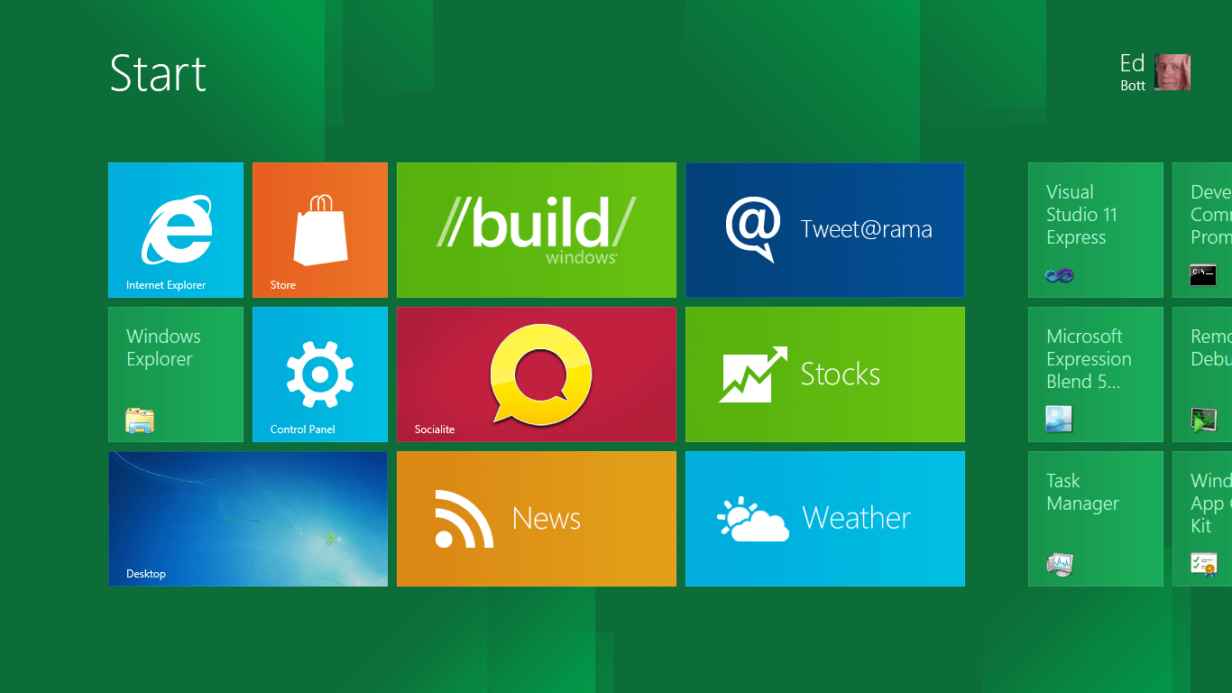
Exploring the Evolution from Irritation to Innovation
In the ever-evolving landscape of operating systems, the transition from Windows 8 to Windows 10 marked a pivotal moment in Microsoft’s quest for user-centric design. Windows 8, with its bold departure from established norms, introduced several features that, for many users, became synonymous with frustration. However, the release of Windows 10 heralded a new era, bidding farewell to the annoyances of its predecessor while ushering in a refined and user-friendly experience. In this comprehensive exploration, we delve into the annoying features of Windows 8 that found no place in Windows 10, celebrating the transformation from irritation to innovation.
1. Start Screen Struggles: A Metro Maze Left Behind
Windows 8’s Tile Tangle Gives Way to Start Menu Harmony
One of the most divisive features of Windows 8 was the Start Screen, adorned with live tiles and a departure from the traditional Start Menu. Users found themselves entangled in a Metro maze, grappling with a user interface that felt more suited to touch-based devices than traditional desktops. Windows 10, recognizing the need for a familiar anchor, bid farewell to the Start Screen, reintroducing the Start Menu in a harmonious blend of the old and the new. Live tiles persisted but in a more subdued manner, allowing users to customize their experience without the overwhelming maze of Windows 8.
2. Charms Charm Out of Fashion: A Swipe Too Many
Charms Bar Fades Away, Making Room for Intuitive Actions
The Charms Bar, a signature feature of Windows 8 accessed by swiping from the right edge, presented a mixed bag of functionality that left users yearning for simplicity. In Windows 10, the Charms Bar gracefully exits the stage, making room for a more intuitive Action Center. The quick-access panel in Windows 10 consolidates notifications, settings, and quick actions, streamlining the user experience without the need for multiple swipes and taps. With the Charms Bar out of fashion, Windows 10 users embrace a more straightforward and consolidated approach to system controls.
3. App Snapping Quirks: Taming the Multi-Monitor Mayhem
Windows 10 Refines App Snapping for Seamless Multitasking
Windows 8 introduced the concept of snapping apps to the sides of the screen, a feature that promised enhanced multitasking. However, users with multiple monitors faced a unique set of challenges, with apps confined to a single screen. Windows 10 addresses this annoyance by introducing improved multi-monitor support, allowing users to snap and manage apps across different displays seamlessly. The evolution from snapping quirks in Windows 8 to refined multi-monitor multitasking in Windows 10 exemplifies Microsoft’s commitment to a versatile and user-friendly operating system.
4. Missing Start Button: A Nostalgic Reunion
Windows 10 Rekindles the Start Button Romance
Windows 8 shocked users by bidding adieu to the iconic Start Button, leaving many feeling adrift in a sea of change. Recognizing the sentimental value and practicality of the Start Button, Windows 10 orchestrates a nostalgic reunion, bringing back the beloved feature. The Start Button in Windows 10 combines the familiarity of the past with the modernity of the present, offering users a centralized hub for accessing apps, settings, and the all-encompassing Start Menu. The absence of the Start Button in Windows 8 becomes a distant memory as Windows 10 bridges the gap between innovation and user comfort.
5. Full-Screen App Dominance: Freedom to Resize Restored
Windows 10 Empowers Users with Resizable App Windows
Windows 8 enforced a full-screen dominance for Windows Store apps, limiting users’ ability to resize and arrange them according to their preferences. Windows 10, understanding the importance of flexibility, liberates users from the constraints of full-screen app dominance. With resizable app windows, users can now enjoy the freedom to arrange and customize their workspace, striking a balance between immersive app experiences and practical multitasking. The annoyance of rigid full-screen dominance in Windows 8 fades away as Windows 10 embraces a more user-centric approach.
6. One-Size-Fits-All Control Panel: A Tailored Settings Experience
Windows 10 Introduces the Settings App, Ushering in Simplicity
Windows 8 left users grappling with a dual-existence—Control Panel for traditional settings and PC Settings for modern app-related configurations. Windows 10, recognizing the need for coherence, introduces the Settings app, streamlining the configuration experience. The one-size-fits-all dilemma of Windows 8 gives way to a tailored settings experience in Windows 10, where users can efficiently manage both system and app settings in a unified and intuitive interface. The transition signifies Microsoft’s commitment to simplifying the user experience.
7. Forced Updates Frustration: Windows 10 Puts Users in Control
Windows 10 Prioritizes User Control Over Forced Updates
Windows 8 earned its fair share of criticism for its mandatory and sometimes disruptive update policy. Windows 10, understanding the diverse needs and preferences of users, introduces a more user-centric approach to updates. While maintaining the importance of security and stability, Windows 10 allows users greater control over the update process. The frustration of forced updates in Windows 8 transforms into a sense of empowerment as Windows 10 puts users in the driver’s seat, ensuring a balance between system maintenance and user convenience.
Conclusion: Windows 10—A Testament to User-Centric Evolution
The journey from Windows 8 to Windows 10 represents more than a mere version upgrade; it symbolizes Microsoft’s commitment to a user-centric evolution. By bidding farewell to the annoyances of Windows 8, Windows 10 emerges as a refined and harmonious operating system that bridges the gap between innovation and user comfort. The annoyances that once defined Windows 8 transform into lessons learned, paving the way for an era where user experience reigns supreme.