Introduction:
In the realm of digital design, Adobe Illustrator serves as a versatile platform, offering a multitude of tools and features to bring creative visions to life with precision and finesse. Among its vast array of capabilities, the graph tool stands out as a powerful instrument for creating visually compelling data visualizations. Whether you’re a seasoned data analyst, a graphic designer, or an aspiring illustrator, understanding how to effectively utilize the graph tool in Adobe Illustrator is essential for crafting informative and engaging graphics. In this comprehensive guide, we’ll embark on a journey to explore the intricacies of the graph tool, from its basic functionalities to advanced techniques for creating dynamic data visualizations.
Chapter 1: Introducing the Graph Tool
At its core, the graph tool in Adobe Illustrator is a dynamic feature that allows users to create, customize, and manipulate graphs and charts directly within the application. From simple bar graphs and pie charts to complex scatter plots and line graphs, the graph tool offers a wide range of options for visualizing data in a clear and concise manner. By understanding how to harness the power of the graph tool, users can transform raw data into compelling visuals that convey meaning and insight.
Chapter 2: Getting Started with the Graph Tool
Before diving into advanced techniques, it’s important to familiarize yourself with the basic functionalities of the graph tool in Adobe Illustrator. Start by creating a new document or opening an existing one. Then, select the graph tool from the toolbar or by navigating to “Object” > “Graph” > “Create”. Choose the type of graph or chart you want to create from the options available, such as bar graph, pie chart, or line graph. Enter your data into the provided spreadsheet-like interface, and customize the appearance and layout of your graph as desired.
Chapter 3: Customizing Graphs and Charts
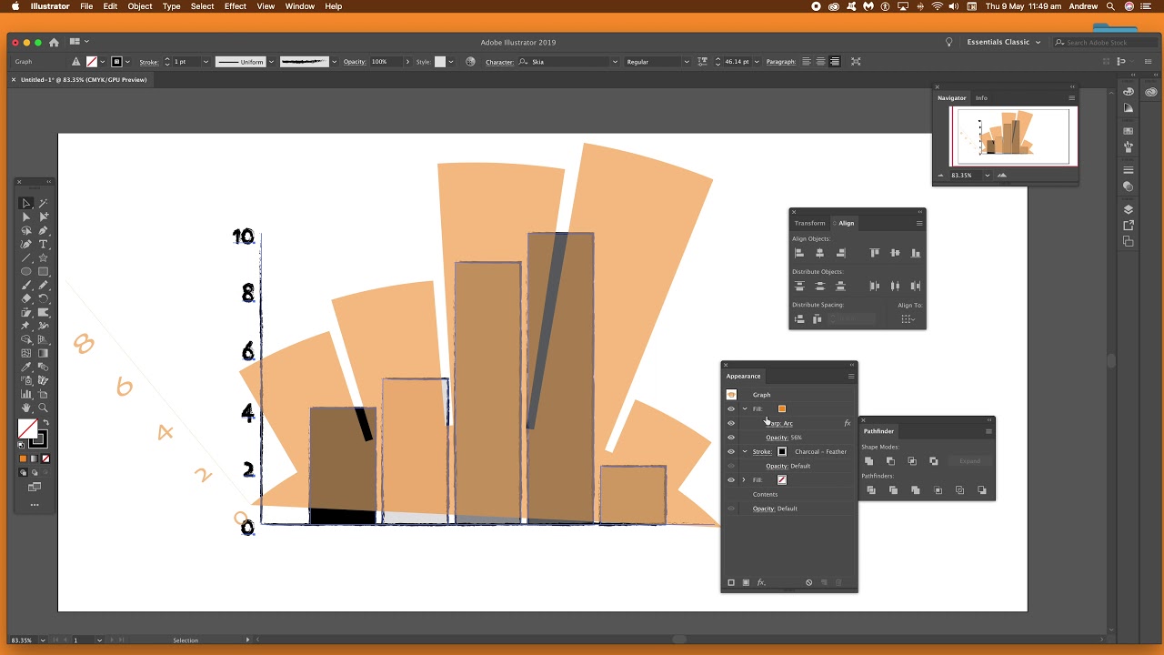
Once you’ve created a basic graph or chart using the graph tool, it’s time to customize its appearance and style to better suit your needs. Use the graph type options panel to adjust settings such as axes, labels, and data markers. Experiment with different color schemes, fonts, and styles to enhance the visual appeal of your graph. Use the appearance panel to apply effects such as gradients, textures, and transparency to individual elements of your graph, such as bars, lines, or pie slices.
Chapter 4: Adding Data Labels and Annotations
To make your graphs and charts more informative and engaging, consider adding data labels and annotations. Use the type tool to add labels and annotations directly onto your graph, providing context and clarity to your data. Experiment with different label formats, such as numeric values, percentages, or category names, to convey information effectively. Use the appearance panel to customize the appearance and style of your labels, such as font size, color, and alignment.
Chapter 5: Exploring Advanced Techniques
For users looking to take their data visualizations to the next level, the graph tool offers a variety of advanced techniques and features to explore. Experiment with adding multiple data sets to a single graph, allowing for easy comparison and analysis of different datasets. Use the graph design options panel to customize the layout and style of your graph, such as axis scaling, gridlines, and tick marks. Explore the possibilities of using custom symbols and shapes to represent data points, adding visual interest and clarity to your graphs.
Chapter 6: Integrating Graphs into Your Workflow
Once you’ve created and customized your graphs and charts using the graph tool in Adobe Illustrator, it’s important to integrate them into your design workflow effectively. Use the layers panel to organize and manage the elements of your graph, such as data points, labels, and annotations. Experiment with combining graphs with other Illustrator tools and techniques, such as shapes, paths, and text, to create dynamic and interactive data visualizations. Consider exporting your graphs as scalable vector graphics (SVG) or encapsulated PostScript (EPS) files for sharing or further editing in other applications.
Chapter 7: Saving and Exporting Graphs
Once you’re satisfied with your data visualizations, it’s important to save and export them for sharing or distribution. Save your Illustrator document in a compatible file format, such as AI or PDF, to preserve the vector properties of your graphs. If you’re creating web-based graphics, consider exporting your graphs as SVG files for scalability and compatibility with web browsers. For print-based projects, export your graphs as high-resolution raster images in formats such as JPEG or PNG.
Conclusion:
Mastering the graph tool in Adobe Illustrator is a journey of exploration and discovery, offering endless possibilities for creating dynamic and informative data visualizations. By understanding the basic functionalities, customizing graphs and charts, adding data labels and annotations, exploring advanced techniques, integrating graphs into your workflow, and saving and exporting your visualizations, you’ll be able to transform raw data into compelling graphics that captivate and inform. So grab your data, set your sights on the canvas, and let the graph tool in Adobe Illustrator become your gateway to unlocking insights and telling stories through the power of visualization.