Introduction: Accordions and tabbed panels are popular user interface components that allow website visitors to access and organize content efficiently, reducing clutter and improving navigation. Adobe Dreamweaver, a versatile web development tool, provides developers with robust features and tools to create accordions and tabbed panels effortlessly using HTML, CSS, and JavaScript. In this extensive guide, we’ll explore the process of creating accordions and tabbed panels in Adobe Dreamweaver, covering various techniques, best practices, and customization options to help you design intuitive and interactive user interfaces for your websites.
Understanding Accordions and Tabbed Panels: Accordions and tabbed panels are interactive UI components that enable users to toggle between multiple content sections within a limited space. Accordions typically consist of collapsible panels that expand or collapse when clicked, revealing hidden content. Tabbed panels, on the other hand, display multiple content sections as tabs, allowing users to switch between them by clicking on the tab headers. These components are commonly used for organizing and presenting content such as FAQs, product descriptions, feature lists, and navigation menus in a concise and visually appealing manner.
Step 1: Planning Your UI Components Before diving into implementation, it’s essential to plan your accordions and tabbed panels carefully. Consider the following factors when planning your UI components in Adobe Dreamweaver:
- Identify content sections: Determine the content you want to organize and present within your accordions or tabbed panels, such as text, images, videos, or other multimedia elements.
- Define user interactions: Decide how users will interact with your UI components, including how accordion panels or tabbed sections will expand, collapse, or switch between content sections.
- Design visual hierarchy: Arrange content sections in a logical and visually appealing manner within your accordions or tabbed panels, ensuring that users can easily navigate and access the information they need.
- Consider responsiveness: Plan for responsive design considerations to ensure that your accordions and tabbed panels adapt to different screen sizes and devices, providing a consistent user experience across desktops, tablets, and smartphones.
Step 2: Creating Accordions in Adobe Dreamweaver Adobe Dreamweaver offers multiple methods for creating accordions, ranging from CSS-only techniques to JavaScript-based solutions. Here’s how to create accordions in Adobe Dreamweaver:
- HTML structure: Define the HTML structure for your accordion component using nested HTML elements such as <div> or <section> for accordion panels and content sections.
- CSS styling: Apply CSS styles to control the appearance and behavior of your accordion panels, including dimensions, borders, background colors, typography, and transitions for smooth animation effects.
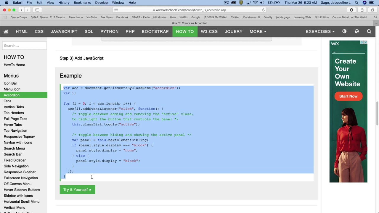
- JavaScript functionality: Use JavaScript to add interactivity to your accordion component, such as toggling panel visibility when users click on accordion headers or animating panel expansion and collapse with slide or fade effects.
- Testing and refinement: Test your accordion component in Adobe Dreamweaver’s live view mode or in a web browser to ensure smooth functionality and visual consistency across different devices and screen sizes. Make adjustments as needed to fine-tune the appearance and behavior of your accordion panels.
Step 3: Creating Tabbed Panels in Adobe Dreamweaver Tabbed panels can be implemented using a similar approach to accordions, with HTML, CSS, and JavaScript working together to create the interactive tabs and content sections. Here’s how to create tabbed panels in Adobe Dreamweaver:
- HTML structure: Define the HTML structure for your tabbed panel component using <ul> and <li> elements for tab headers and <div> elements for tab content sections.
- CSS styling: Apply CSS styles to customize the appearance of your tab headers and content sections, including dimensions, colors, typography, borders, and transitions for tab switching effects.
- JavaScript functionality: Use JavaScript to add functionality to your tabbed panel component, such as handling tab click events, toggling tab visibility, and updating tab styles to indicate the active tab.
- Testing and refinement: Test your tabbed panel component in Adobe Dreamweaver’s live view mode or in a web browser to ensure smooth functionality and visual consistency across different devices and screen sizes. Make adjustments as needed to optimize the user experience and ensure accessibility for all users.
Step 4: Customizing and Enhancing UI Components Once you’ve created your accordions and tabbed panels in Adobe Dreamweaver, you can customize and enhance them further to match your design preferences and website branding. Consider the following customization options:
- Styling: Experiment with different CSS styles to customize the appearance of your accordion panels or tab headers, including colors, gradients, borders, shadows, and hover effects.
- Animation: Add CSS transitions or JavaScript animations to create smooth animation effects when expanding or collapsing accordion panels or switching between tabbed sections.
- Accessibility: Ensure that your UI components are accessible to all users by following web accessibility guidelines, including providing keyboard navigation, focus states, and ARIA attributes for screen readers.
- Responsive design: Optimize your accordions and tabbed panels for responsive design by using CSS media queries to adjust layout and styling for different screen sizes and devices, ensuring a consistent user experience across desktops, tablets, and smartphones.
Step 5: Testing and Optimization After customizing and enhancing your UI components in Adobe Dreamweaver, it’s essential to test their functionality and performance across different browsers and devices. Conduct thorough testing to ensure that your accordions and tabbed panels behave as expected and deliver a seamless and intuitive user experience. Monitor user feedback and analytics data to identify any usability issues or performance bottlenecks and make necessary optimizations to enhance user experience.
Conclusion: Creating accordions and tabbed panels in Adobe Dreamweaver allows you to design intuitive and interactive user interfaces that organize and present content effectively. By following the steps outlined in this guide and leveraging Dreamweaver’s features and tools, you can create dynamic and visually appealing UI components that engage users and improve navigation efficiency on your websites. Whether you’re a novice web developer or seasoned professional, mastering the art of creating accordions and tabbed panels in Dreamweaver empowers you to design compelling and user-friendly web experiences that captivate and delight visitors.