Introduction: Typography plays a crucial role in web design, influencing readability, user experience, and visual appeal. Adobe Dreamweaver, a leading web development tool, provides developers with powerful features and tools for working with fonts and typography, allowing them to create visually stunning and highly legible web content. In this extensive guide, we’ll explore the process of working with fonts in Adobe Dreamweaver, covering various techniques, best practices, and customization options to help you master typography and enhance the design of your websites.
Understanding Typography Basics: Typography encompasses the art and technique of arranging typefaces to make written language legible, readable, and visually appealing. Key elements of typography include font selection, font size, line spacing, letter spacing, and text alignment, all of which contribute to the overall readability and aesthetics of web content. Adobe Dreamweaver provides developers with a range of tools and features to manipulate typography effectively, allowing them to create engaging and visually cohesive web designs.
Step 1: Choosing Fonts and Typefaces The first step in working with fonts in Adobe Dreamweaver is selecting the right fonts and typefaces for your project. Consider the following factors when choosing fonts:
- Readability: Prioritize legibility and readability when selecting fonts, especially for body text. Choose fonts with clear letterforms and appropriate x-heights that are easy to read on screens.
- Branding: Align font choices with your brand identity and design aesthetics. Select fonts that convey the personality and tone of your brand while maintaining consistency across various brand touchpoints.
- Contrast: Create visual interest and hierarchy by combining fonts with contrasting characteristics, such as serif and sans-serif pairings or different weights and styles within the same typeface family.
- Accessibility: Ensure that selected fonts are accessible to all users, including those with visual impairments or reading disabilities. Choose fonts with sufficient contrast ratios and consider providing alternative font options for users who may have difficulty reading certain typefaces.
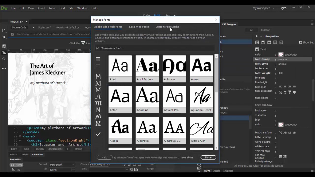
Step 2: Managing Fonts in Adobe Dreamweaver Adobe Dreamweaver offers several tools and features for managing fonts and typography within web projects. Here’s how to work with fonts in Dreamweaver:
- Font selection: Use Dreamweaver’s Property Inspector or CSS Designer panel to specify font families, font sizes, font weights, and other typographic properties for HTML elements.
- Font embedding: Embed custom fonts or web font services such as Google Fonts or Adobe Fonts into your web projects using Dreamweaver’s integration with third-party font providers or by linking to font files hosted on your server.
- Font fallbacks: Define fallback font stacks in CSS to ensure graceful degradation if specified fonts are not available on users’ devices. Include generic font families as fallback options to maintain consistency across different platforms and devices.
- Responsive typography: Implement responsive typography techniques using CSS media queries to adjust font sizes, line heights, and spacing for optimal readability and legibility on various screen sizes and devices.
Step 3: Styling Text Elements Once you’ve chosen fonts and defined typographic properties, you can style text elements within your web projects using Adobe Dreamweaver’s CSS editing capabilities. Here’s how to style text elements in Dreamweaver:
- CSS styling: Apply CSS styles to text elements such as headings, paragraphs, links, and lists using Dreamweaver’s CSS Designer panel or by directly editing CSS files.
- Text formatting: Customize text formatting options such as font size, font weight, font style, text color, text alignment, and text decoration to achieve the desired visual appearance.
- Typography effects: Experiment with typography effects such as text shadows, text outlines, text transformations, and letter spacing to add visual interest and emphasis to text elements.
- Type hierarchy: Establish a clear typographic hierarchy by using different font sizes, font weights, and font styles for headings, subheadings, body text, and other content elements. Ensure that the hierarchy reflects the importance and structure of the content.
Step 4: Optimizing Typography for Web Performance In addition to aesthetics and readability, it’s essential to optimize typography for web performance to ensure fast loading times and optimal user experience. Consider the following optimization techniques:
- Font optimization: Minimize the number of font files and font variants used in your web projects to reduce HTTP requests and improve loading times. Choose web-safe fonts or subset custom fonts to include only the necessary characters and glyphs.
- Font caching: Leverage browser caching mechanisms to cache font files and reduce server requests for subsequent page loads. Configure cache control headers to specify caching policies for font files and ensure efficient resource delivery.
- Font loading strategies: Implement font loading strategies such as asynchronous font loading or font preloading to prioritize critical font resources and prevent render-blocking delays. Use web font loading APIs or JavaScript libraries to control font loading behavior and optimize performance.
- Performance testing: Conduct performance testing using tools like Google PageSpeed Insights or WebPageTest to assess typography-related performance metrics such as font loading times, render times, and overall page speed. Identify performance bottlenecks and make optimizations to improve typography performance and user experience.
Step 5: Testing and Refinement After implementing typography in Adobe Dreamweaver, it’s essential to test your typography choices across different devices, browsers, and screen sizes to ensure consistency and compatibility. Conduct usability testing and gather feedback from users to identify any readability issues or typographic inconsistencies. Make refinements as needed to improve readability, accessibility, and overall user experience.
Conclusion: Working with fonts and typography in Adobe Dreamweaver allows you to create visually stunning and highly legible web content that engages and captivates users. By following the steps outlined in this guide and leveraging Dreamweaver’s features and tools, you can master typography and design compelling web experiences that reflect your brand identity and resonate with your target audience. Whether you’re a beginner or experienced web developer, understanding typography principles and applying them effectively in Dreamweaver empowers you to create impactful and visually cohesive web designs that leave a lasting impression on users.